
Presenter
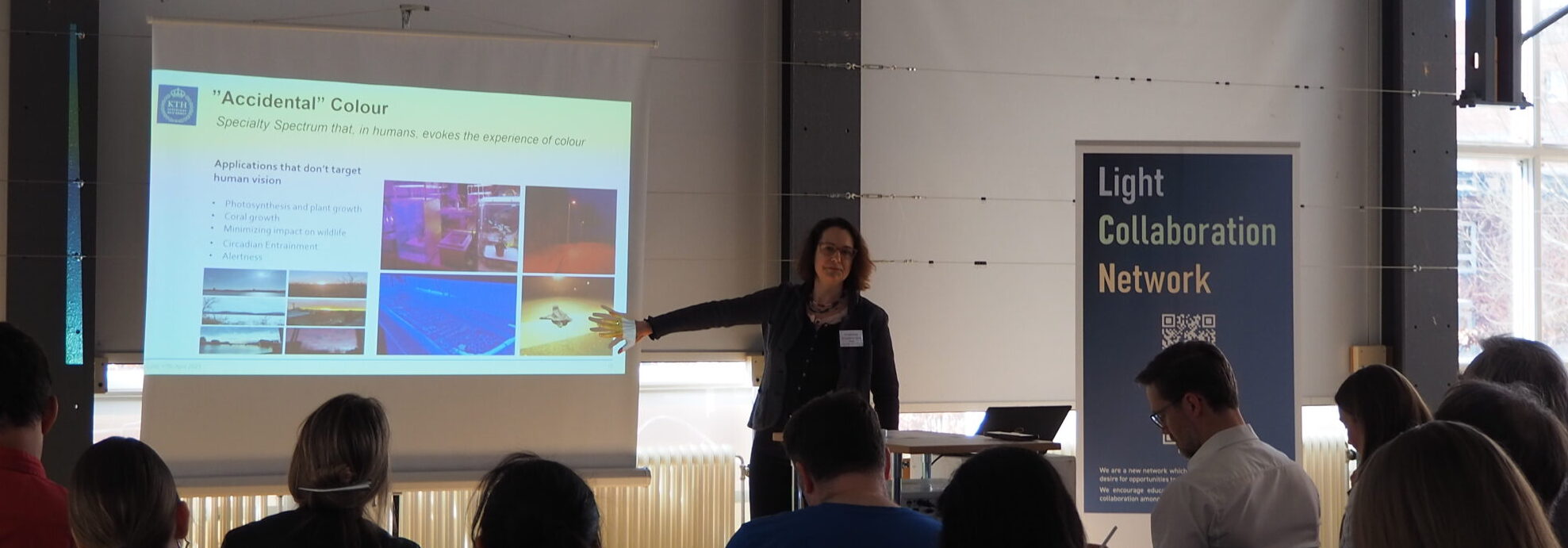
Ute started her presentation with the observation that working with light means working with colour. Some different areas where one might want to design with non-white light include:
- Design with visual hierarchy as a way of using light to direct attention. We apparently see light colours more quickly, so we are drawn towards them faster. They can support an atmosphere or ambience, not only using artificial light but also stained glass to separate and accentuate different colours from natural light.
- Signalling and security. Examples being traffic lights or security exit lighting.
- Light not for human use, i.e., for plants or wildlife
There is room for a project to bring forward guidance in this area, especially when using light in wayfinding, that it is accessible and works for everyone who will enter the space. Designing with visual hierarchy is hard to do as we can’t evaluate perceived brightness, so it’s only by looking at the implemented result of a design that you can achieve the effect you had hoped to.